Just some logos.
Seasons
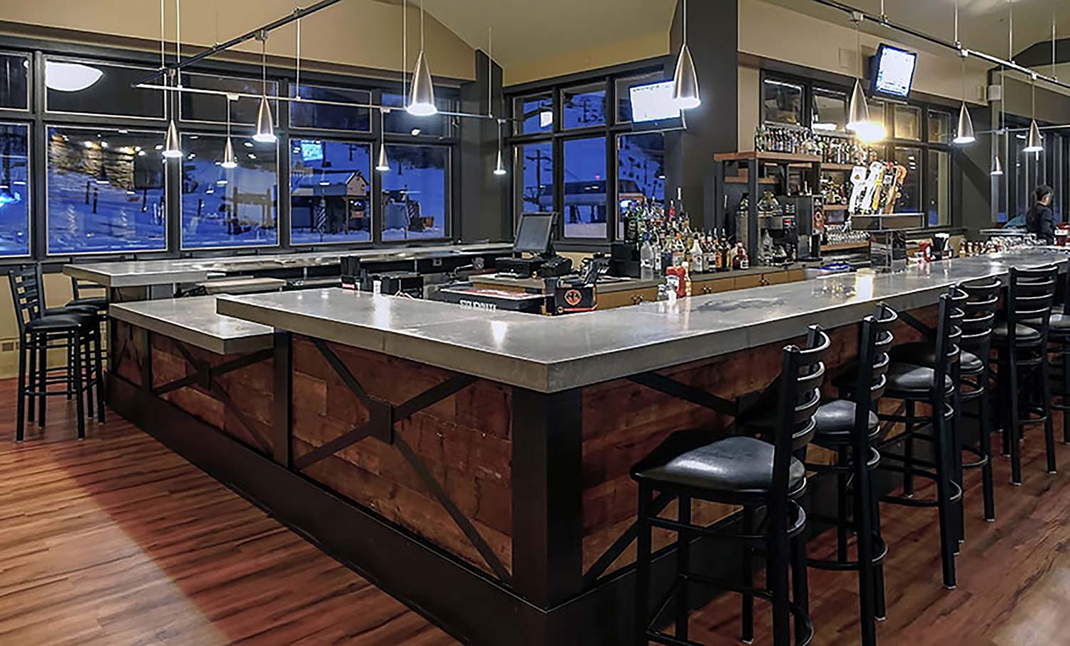
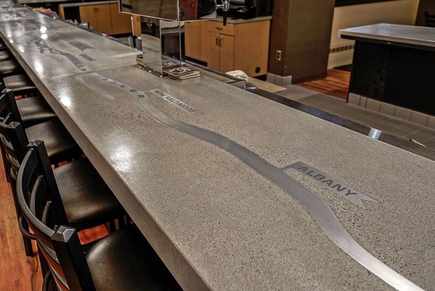
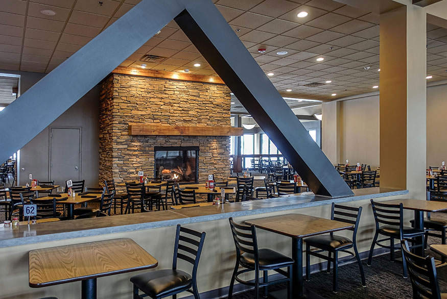
An Upstate NY ski resort, Windham Mountain, was rebranding their lodge restaurant and reached out to local designers for ideas. I spent a lot of winter days while in college at that mountain and I jumped at the opportunity to help them out.
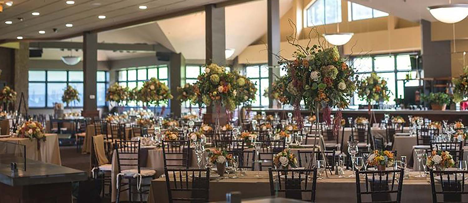
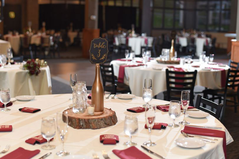
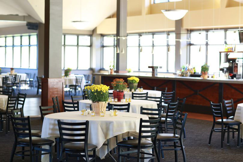
The resort itself is pretty upscale - it's consistently rated as one of the best resorts in the state and is accessible to very affluent populations who come from downstate for weekend getaways. The resort hosts corporate events, weddings, sport competitions, and festivals all year round. They were rebranding the future "Seasons" to be a nicer version of the space, really focusing on giving it an updated and modern feel and a new atmosphere.
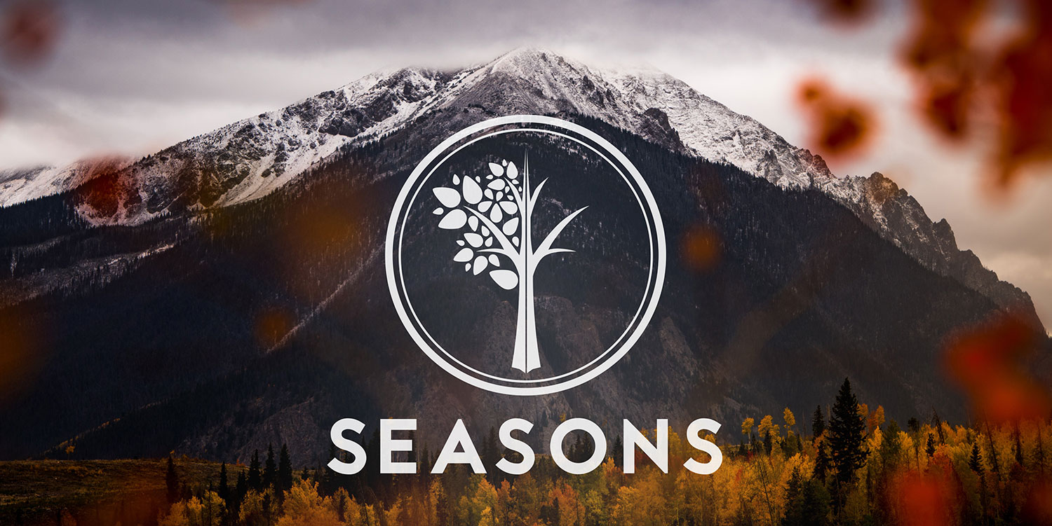
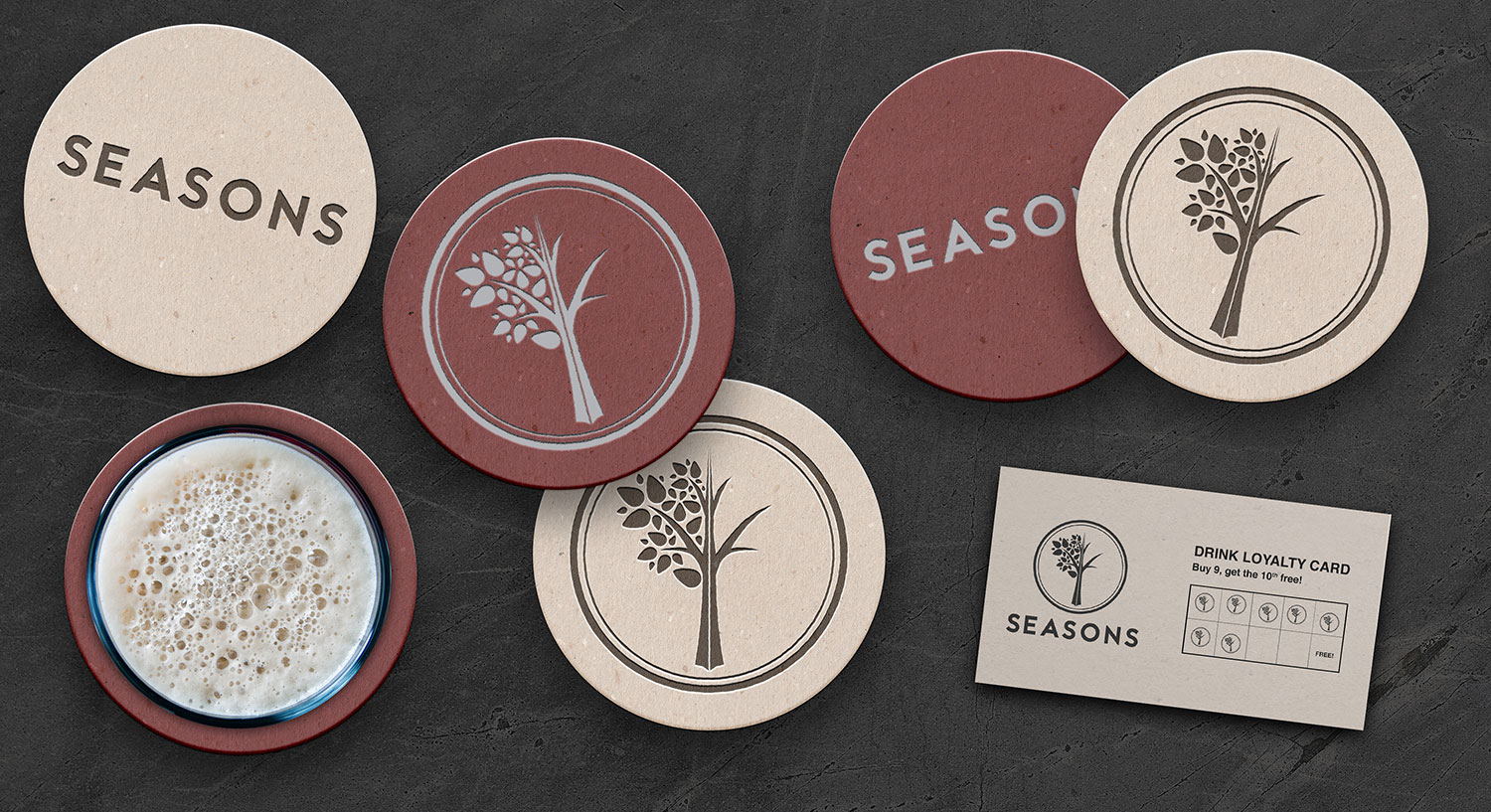
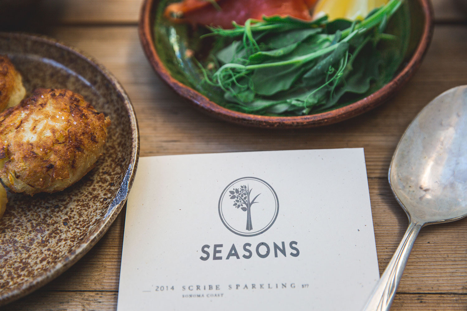
After a few discussions with the group, I proposed a logo that centered around an outline of a tree, one half with leaves, the other half without. They really liked the idea of the tree in it's different "seasons" and the versatility of the logo itself.
DuPont Pride
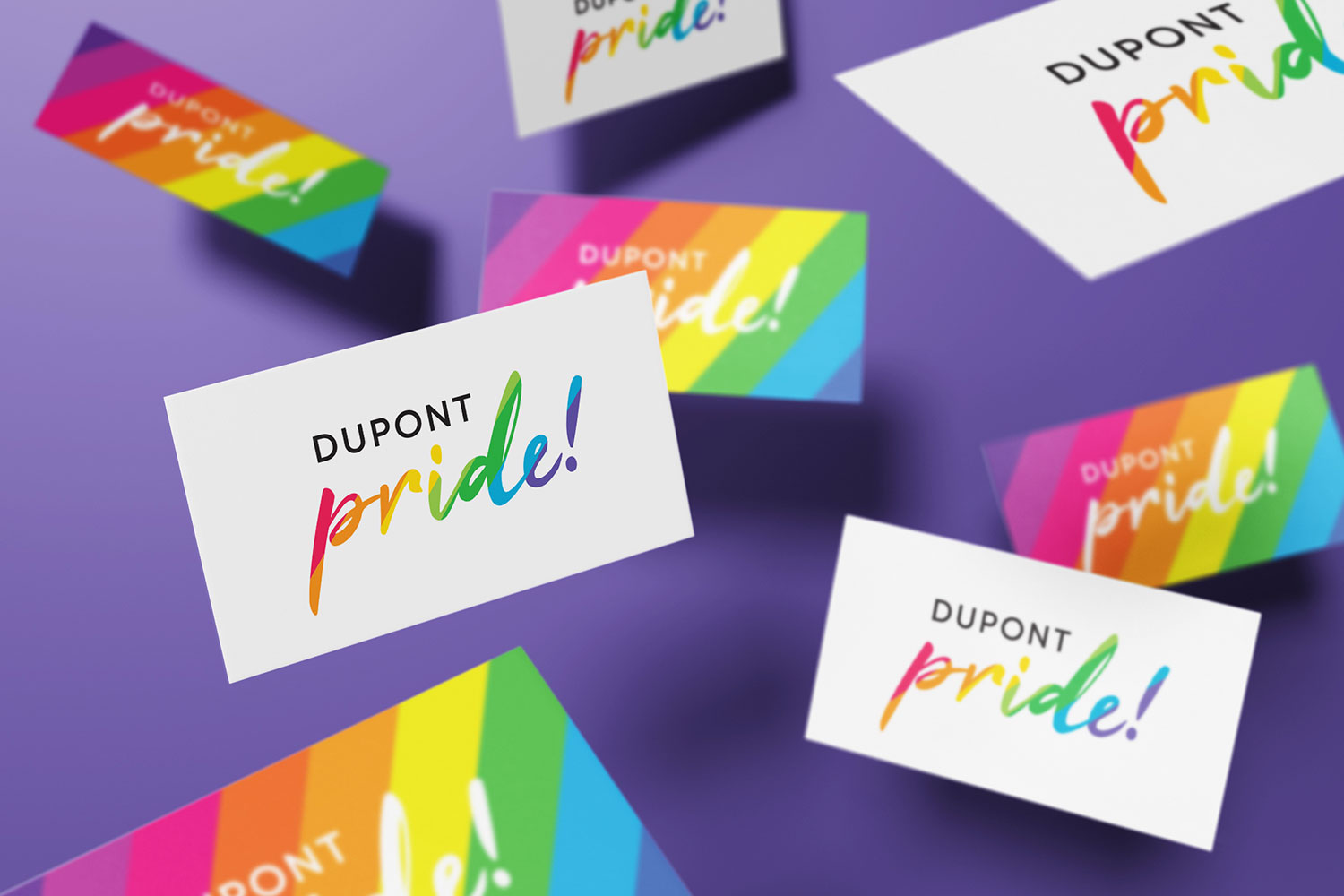
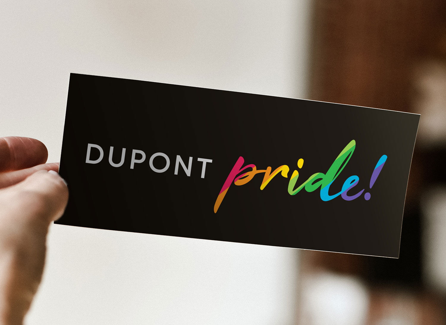
DuPont's global LGBTQ employee resource group was looking to rebrand themselves "DuPont Pride" and needed a new logo. I worked with them to find something that matched the spirit of the ERG and their goals. Through many iterations, we decided on this:
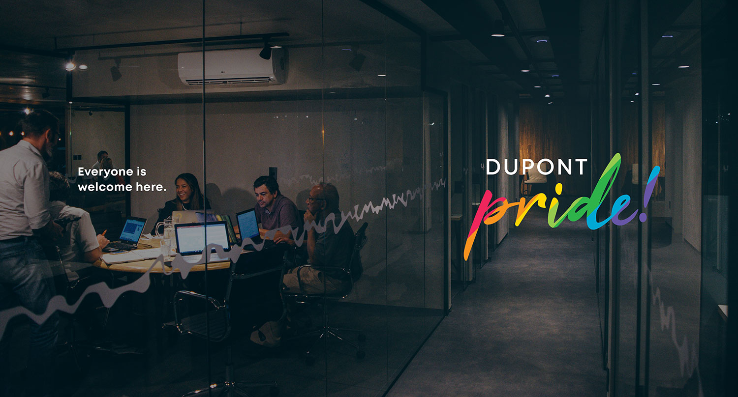
The script font made it personable and friendly which reflected the environment the group was looking to create. I added the exclamation point to show the groups mantra for visibility in the workplace - that they were there and they weren't going to be anyone except who they were.
OH-Fest 9
Oneonta State College and its neighboring university, Hartwick College, host a spring festival each year called OH-Fest (O for Oneonta, H for Hartwick). For the 9th year's festival, the student organizations opened up a contest to students for a chance to design the festival's logo. The only rules were that the logo needed to use red and blue (the two schools colors) and needed to have the number "9".
The design I submitted was a bit more grungy than the logos they had in years past. I used paint splatters to give the logo character and showed the schools two mascots, Oneonta's Red Dragon and Hartwick's Hawk coming out of the splatter that corresponded with the school's color.
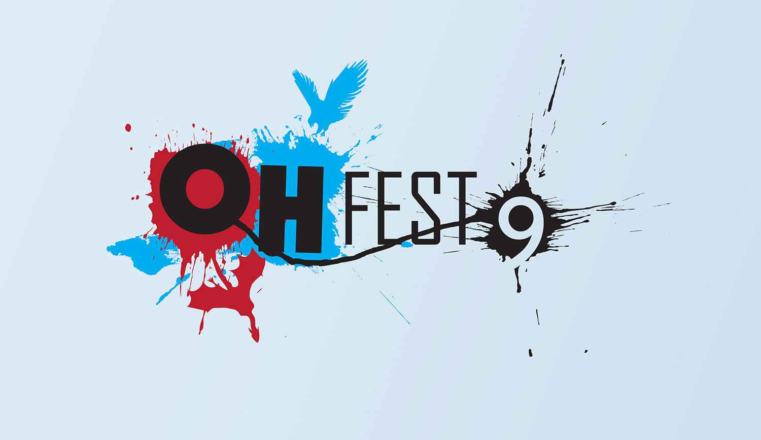
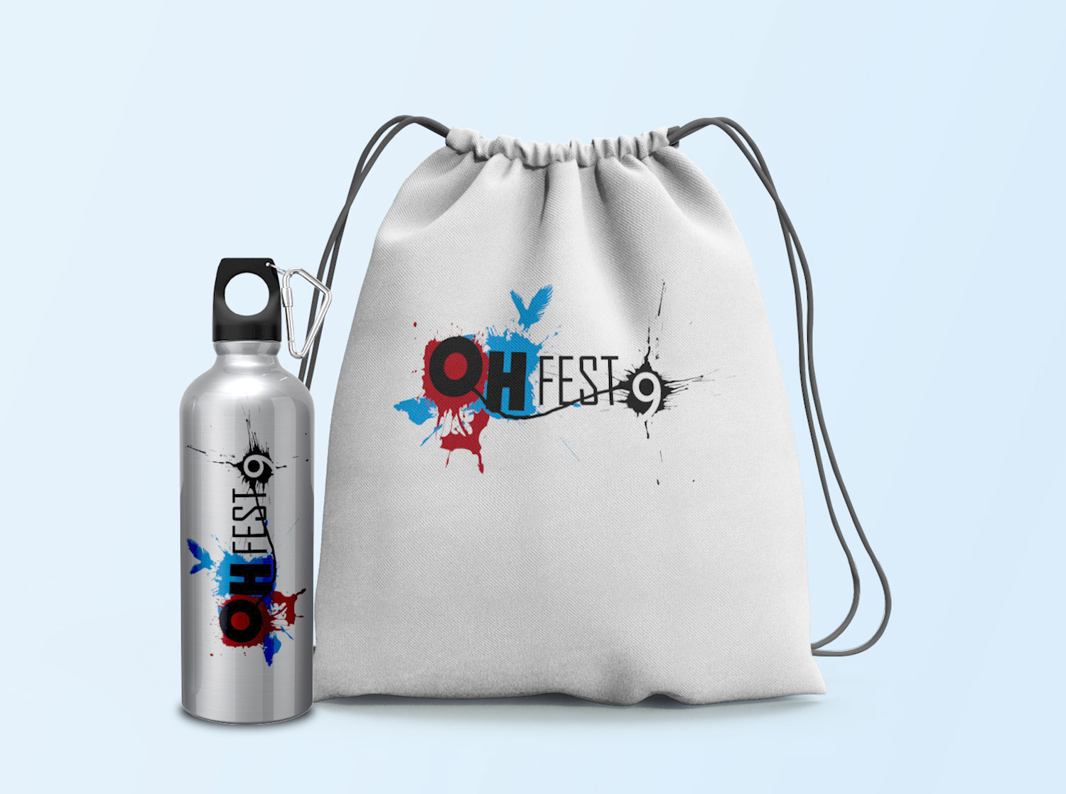
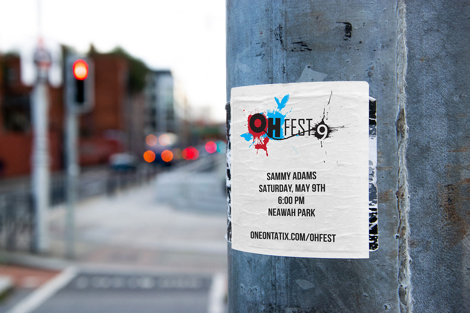
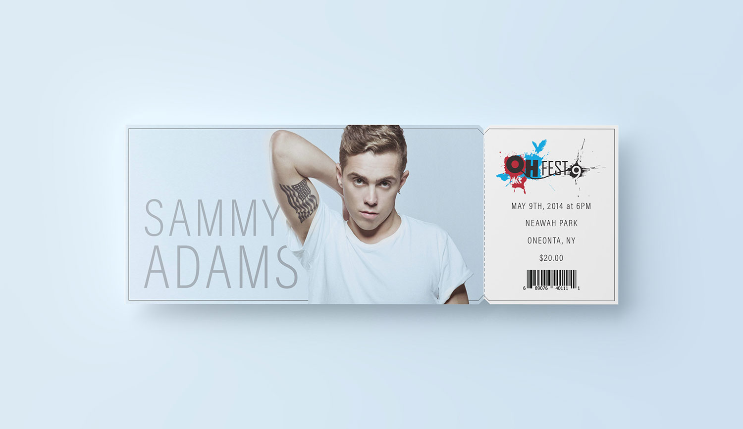
The design was very well received by the student organizations from both schools and was chosen as the festival's logo. It was used on advertising and event materials.
Sahara Express
A popular middle eastern cuisine take-out place was looking for a new logo; one that paid homage to the owners Chaldean heritage through the sand dunes of current day Iraq, once known as Mesopotamia.
The Chaldean people relied heavily on the Tigris-Euphrates river for water and transportation. In a way, it was their "express" and I created the logo with that in mind. The proposal I came up with featured two stylized dunes sitting under a hot sun of the Sahara with an extremely simplified waterway running through them.
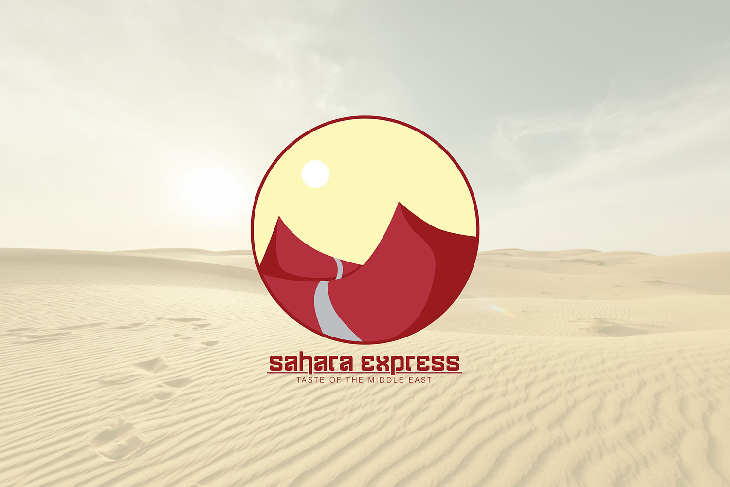
Unfortunately, another design was used as their final logo but I thought this one did a good job at fulfilling the requests made by the client and I like the connection made between the content of the graphic and the name of the business.