Fun, short projects.
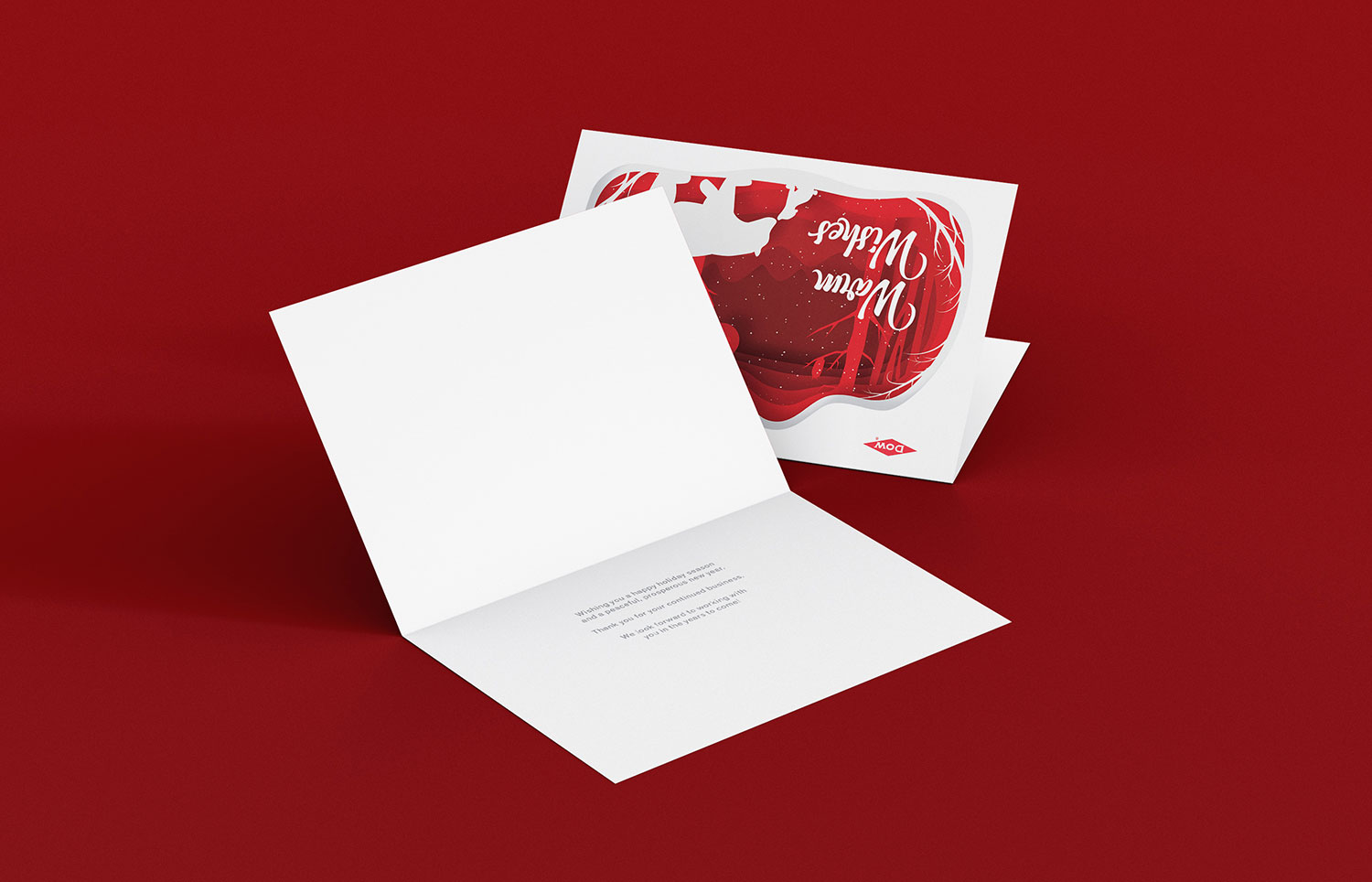
DowDuPont Holiday Greeting Card
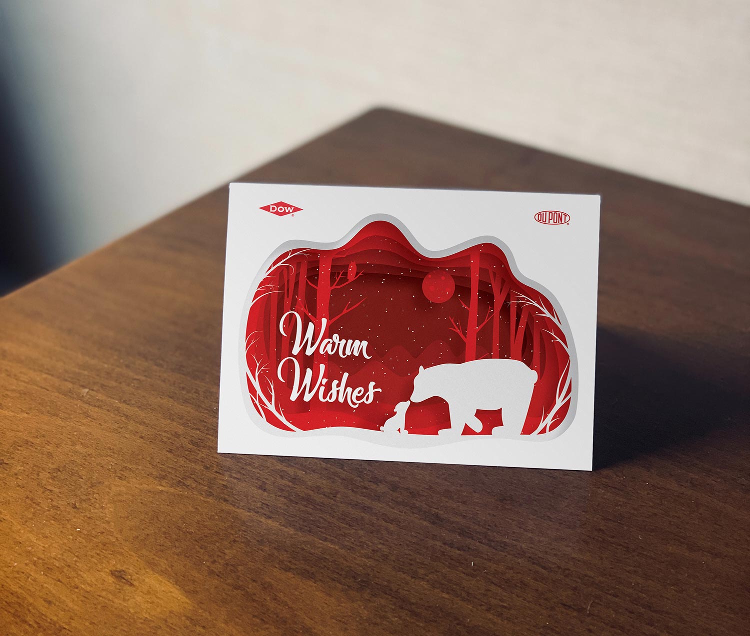
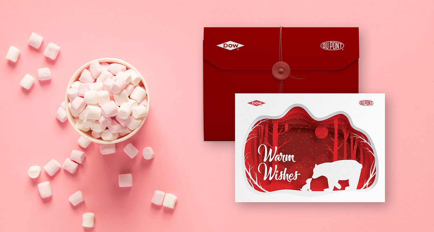
In the middle of the DowDuPont merger, corporate needed a holiday card designed to send to their customers.
I created a non-denominational graphic and modelled it after those beautiful paper-cut illustrations. The layered style gave dimension and playfulness to the design while the scene mimicked something you’d see in a holiday snow globe, warm and invite even in a snowy setting.
"Duck Donuts Questions" Graphic
A fun side project I worked on for an internal team at DuPont.
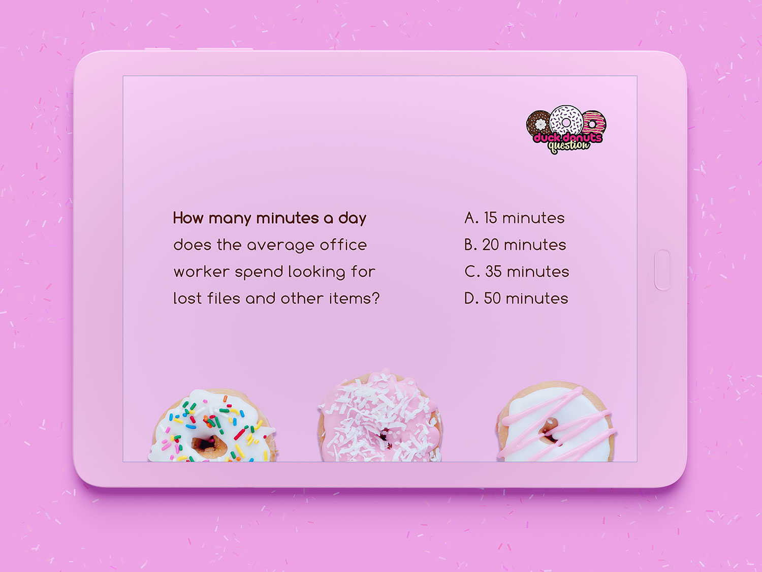
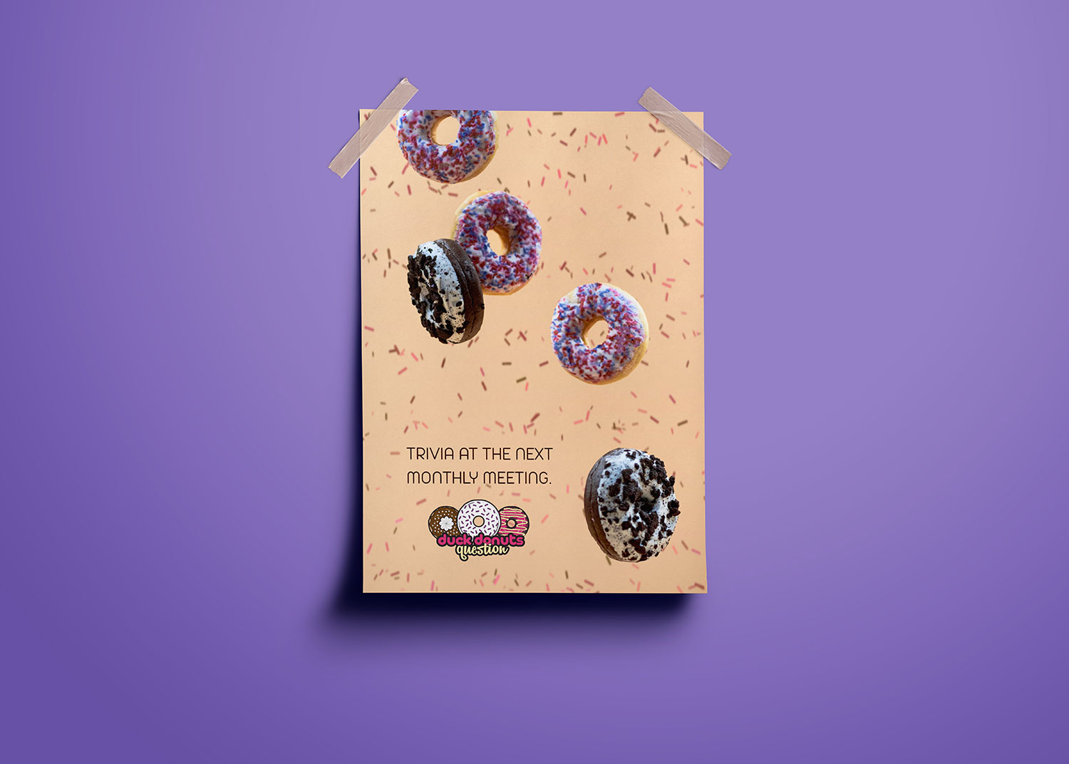
At the end of their monthly meetings, team leaders host a trivia session where employees can win a box of donuts from a popular, local donut shop, Duck Donuts. They requested a small graphic for the trivia game to get attendees excited and involved.
The graphic was going to be used digitally in the meeting presentations and on print pieces internally.
Art Show Promo Work
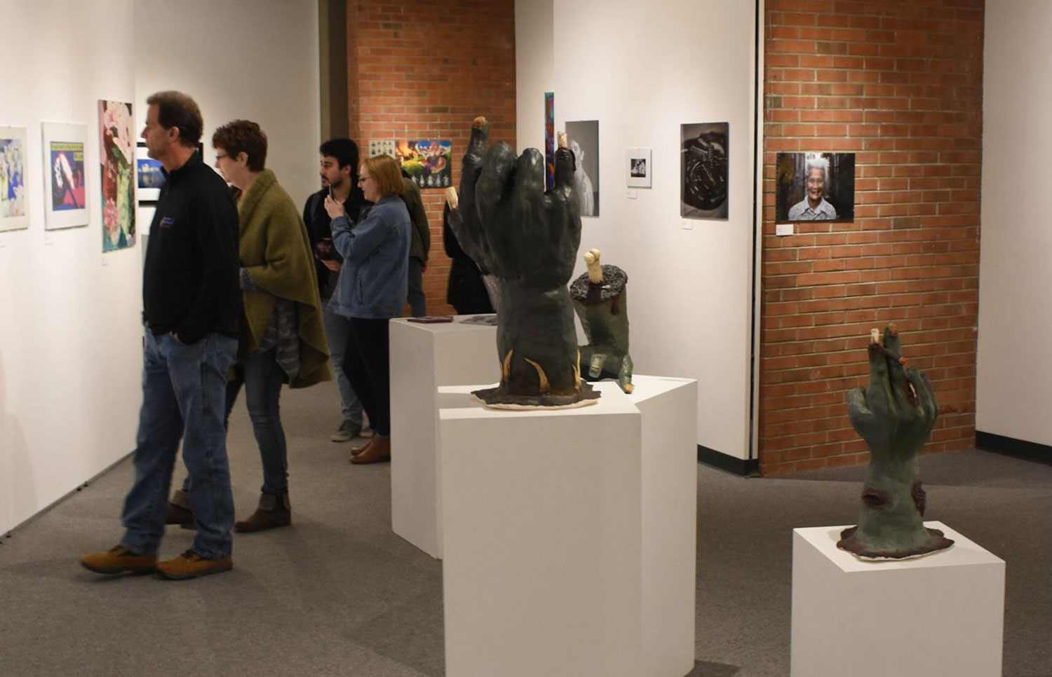
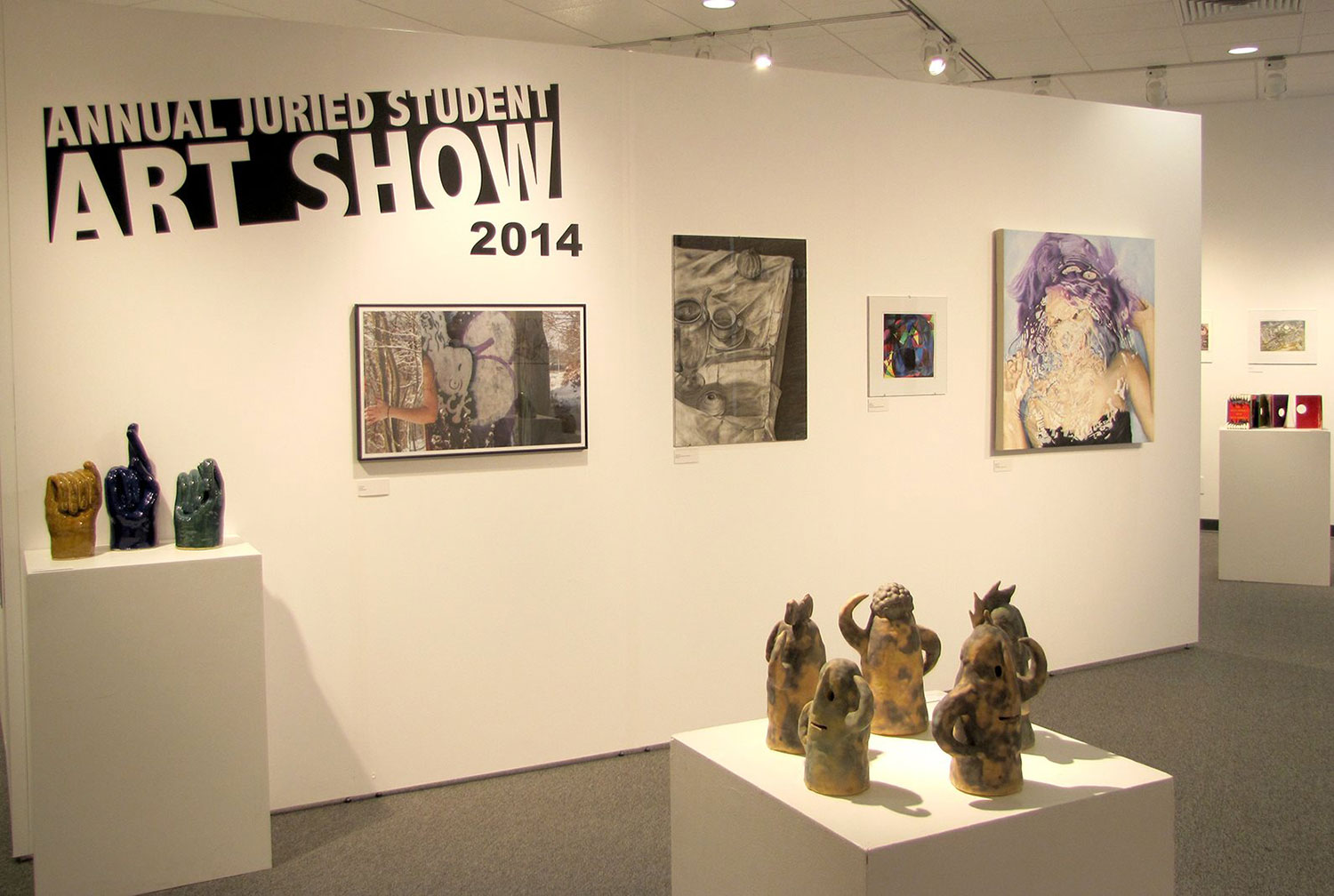
There was a contest among the senior design students of SUNY Oneonta to create a poster for the school’s annual student art show. The gallery manager established that he wanted the design to be influenced by the postmodernism movement but ultimately that was the only rule.
After a couple hours of brainstorming and looking for ideas, I scrolled upon an absolute doozy of fish on WikiCommons.
It was so so weird looking, it held my attention for a while. The real thing is even worse. As I stared at it in disgust I knew I had to put it on my poster. I mean, what better way to advertise for an event than with something so strange that you can’t look away?
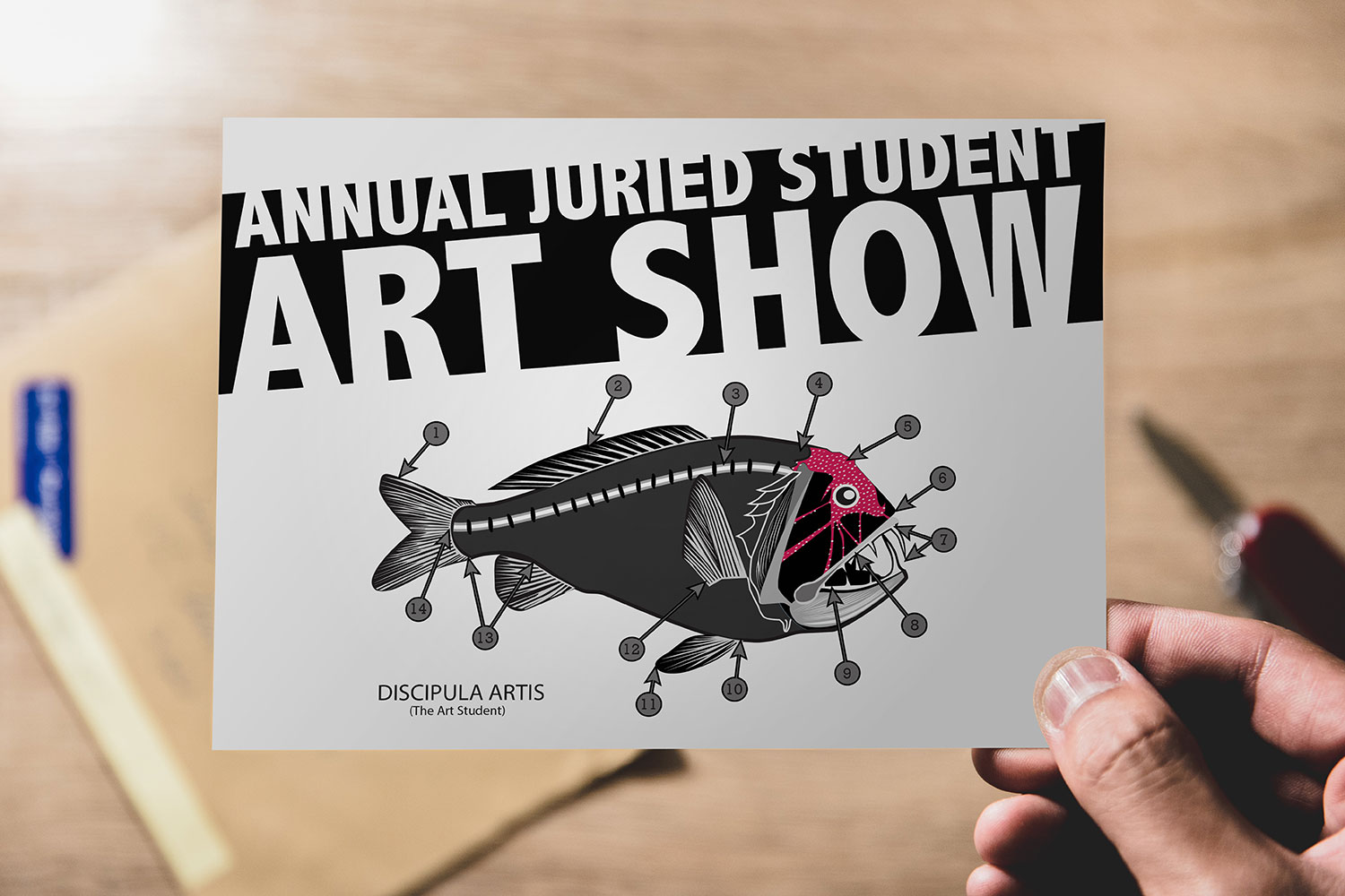
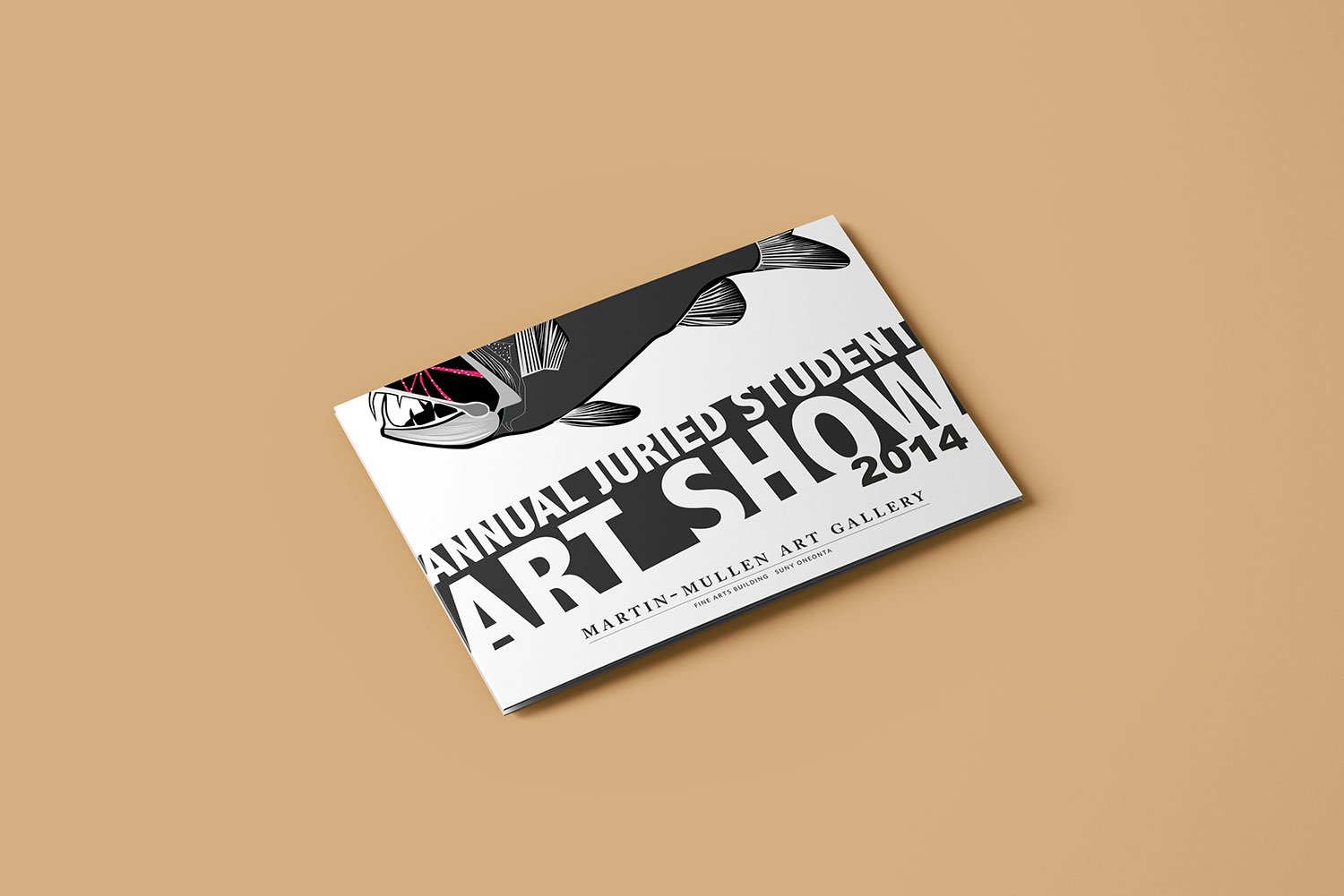
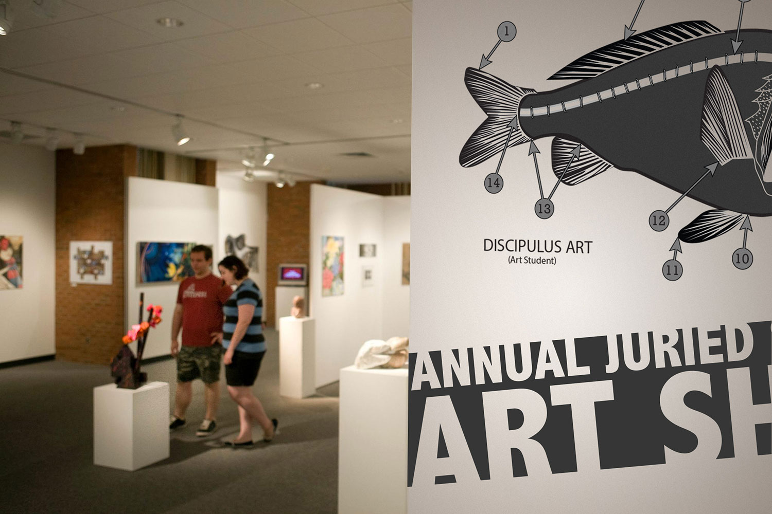
In the spirit of postmodernism, I changed the title of the fish from "Anoplogaster cornuta" to "Discipulus art", translated loosely as "Art Student". The intent and message was that the art student is being picked apart and put on display in the juried art show, much like the fish.
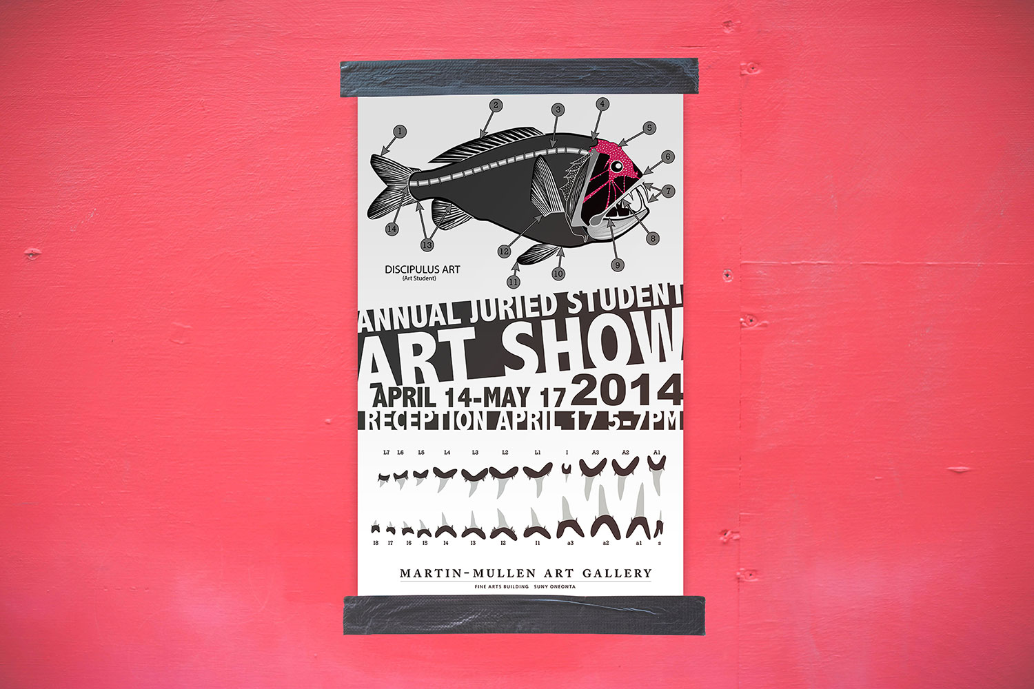
The gallery manager got a kick out of the idea and chose it to advertise for the show. Posters, mailers, exhibit signage, and exhibit brochures were created using the design.
Atlanta Breast Cancer Walk T-Shirt
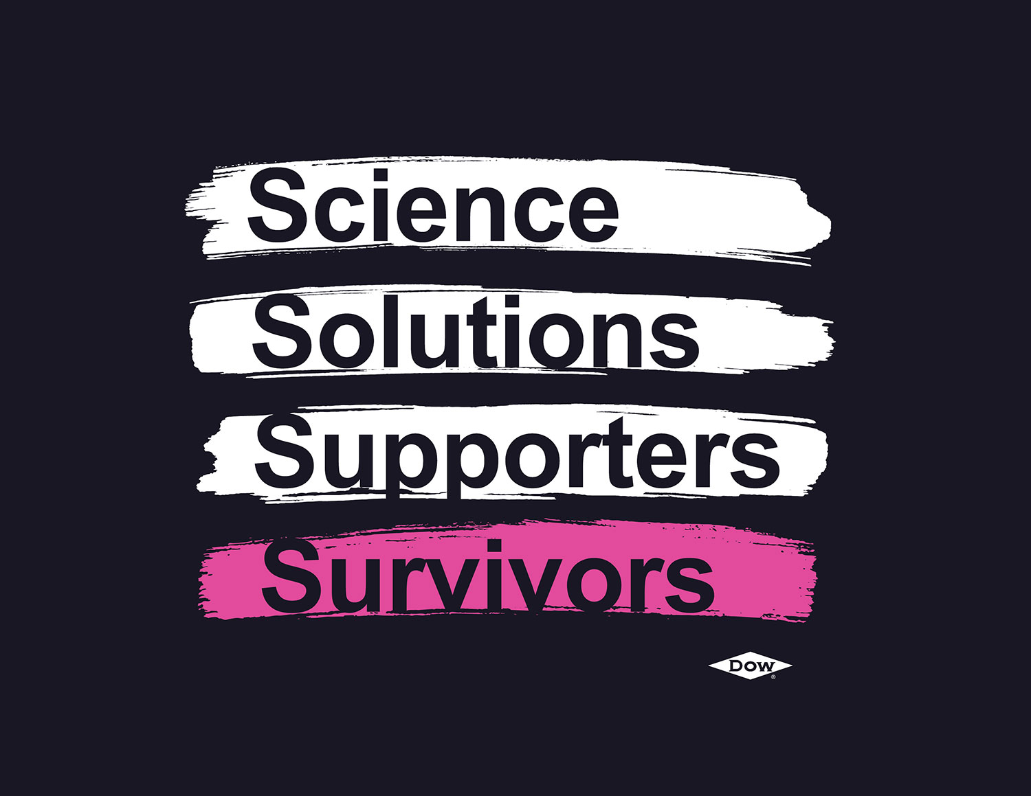
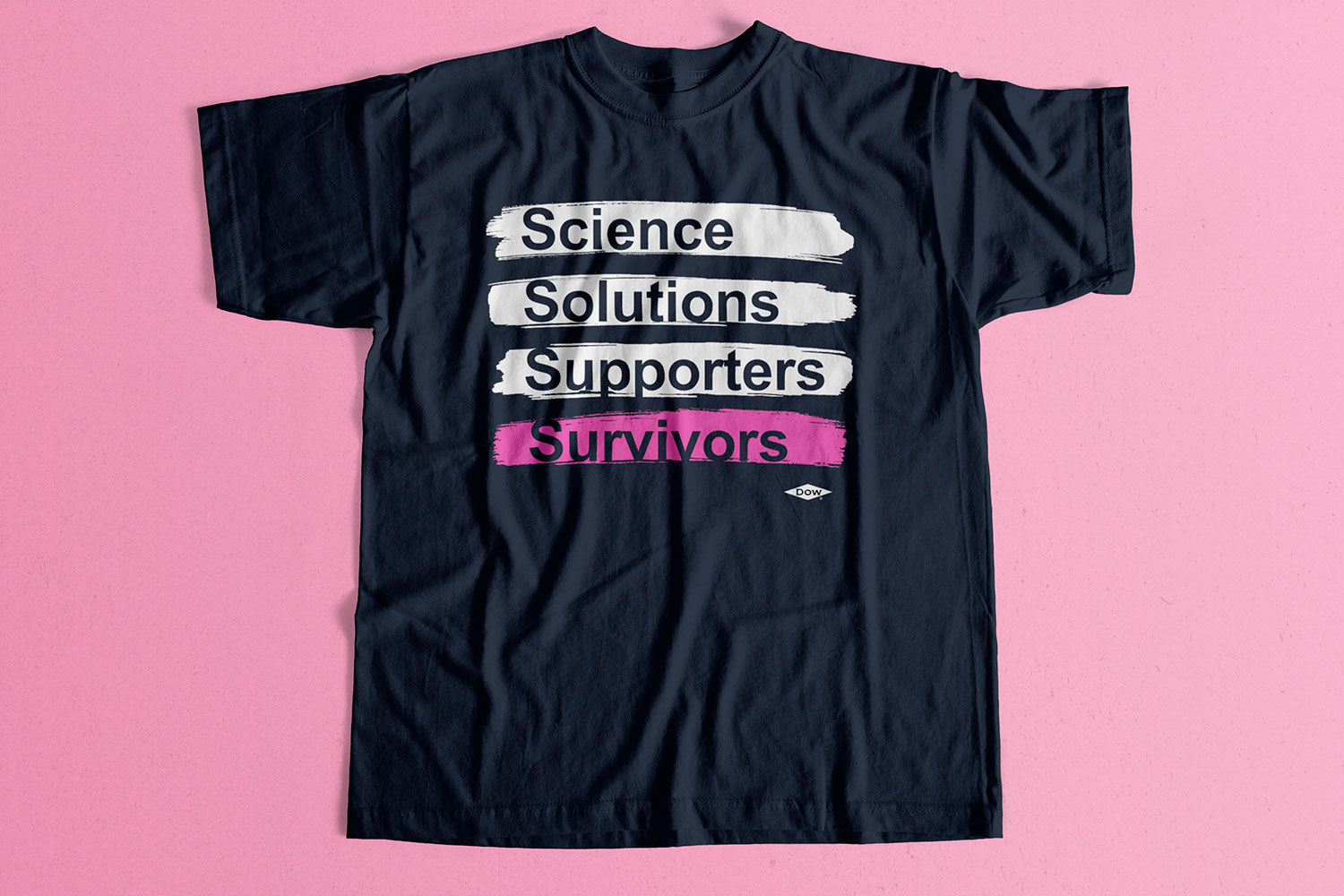
A Georgia Dow site was sponsoring a team to walk at an annual breast cancer walk and requested a t-shirt design. The phrasing they originally suggested was way too word-y and frankly didn't spark any sort of emotion... it was very blah:
"The science of today will be the solutions of tomorrow.
The supporters of today will ensure more survivors tomorrow."
I asked if I could play around with the wording to make it more effective and thankfully they said yes. Their message was good but the execution needed work - it needed to say the same thing but with less. By focusing on the keywords, I found the new wording that allowed for a clean and effective design. Adding a pink color to the “Survivors” line made it alot more impactful.
DuPont Pride Worcester Pride 2019 Ad
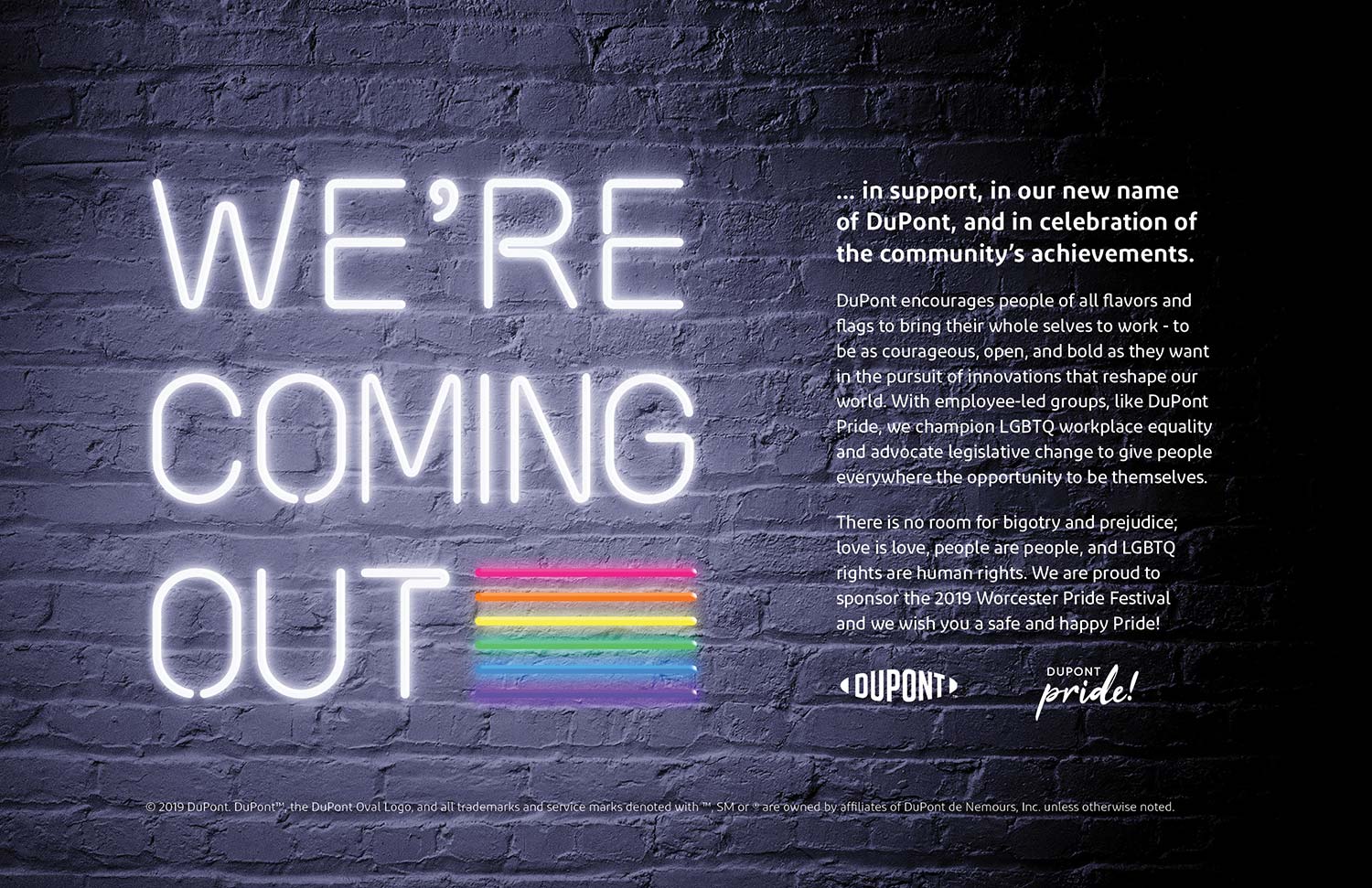
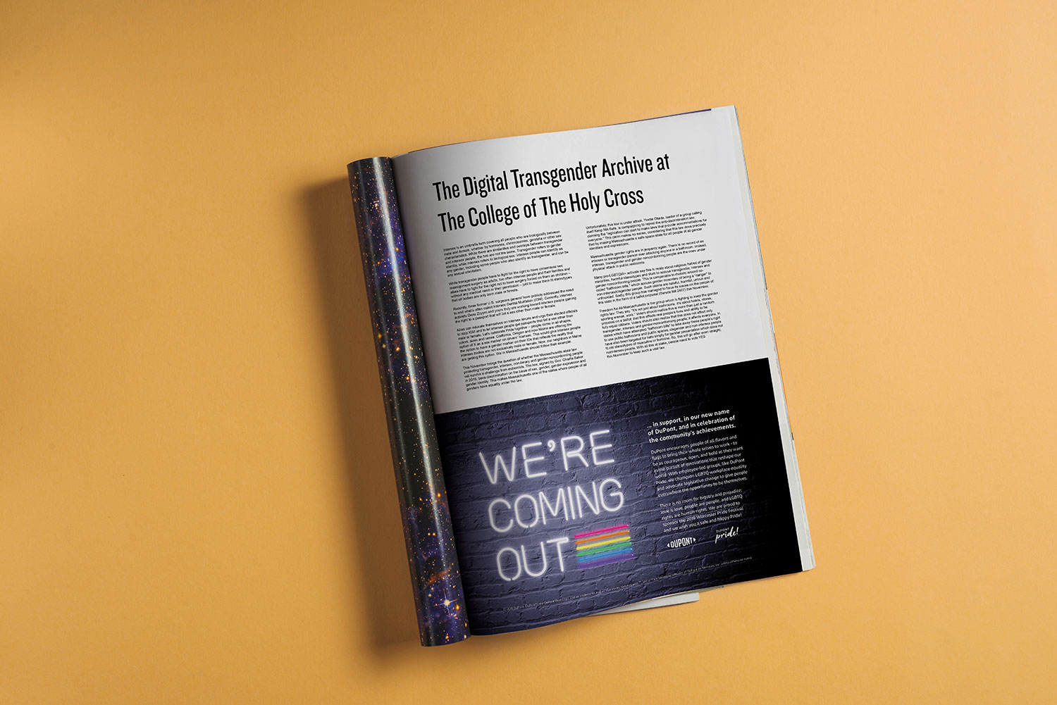
As a part of their sponsorship to the Worcester Pride 2019 Festival, DuPont and their LGBTQ employee resource group, was given space for a half-page ad in the 2019 Pride Guide.
We chose a message of unity and tied it into the multiple transitions the facility and group had gone through in the past several months; the site transitioned from Dow to DuPont and the ERG's name was new, too. The facility had a history of continuously donating to the Worcester Pride organization and we wanted to let the readers know that despite the change in company and names, the site would still continue to come out in support of the local LGBTQ community.
