Branding for wild adventures.
Branding & Identity
Self-initiated
Three months after I graduated college, I applied for a part-time graphic design position at Syracuse's "Rosamond Gifford Zoo". After many interview sessions, the position was cancelled. I was super bummed, not only because I love the work that zoos do and thought it would've been a cool gig, but also because the marketing managers had mentioned that the zoo was looking to rebrand itself in the upcoming year and I was eager to be a part of that.
Much like that job position, the rebrand never happened. But I thought it would be fun to explore the idea and create a new brand myself.
Research
The current logo has been in use ever since I can remember; it’s kinda blah and corporate-y… not too thrilling... For the new logo, I wanted it to look fun and exciting - something that said "adventure".
Rosamond Gifford Zoo's current logo
I am a huge fan of the new Chester Zoo, Toledo Zoo, and San Diego Zoo rebrands. I think they successfully capture the feeling of adventure and curiosity with designs that appeal to kids and adults alike. The use of typography gives the logos a lot of character, even in one color.
Rebranded zoo logos (graphics credit to UnderConsideration.com)
New Brand Elements
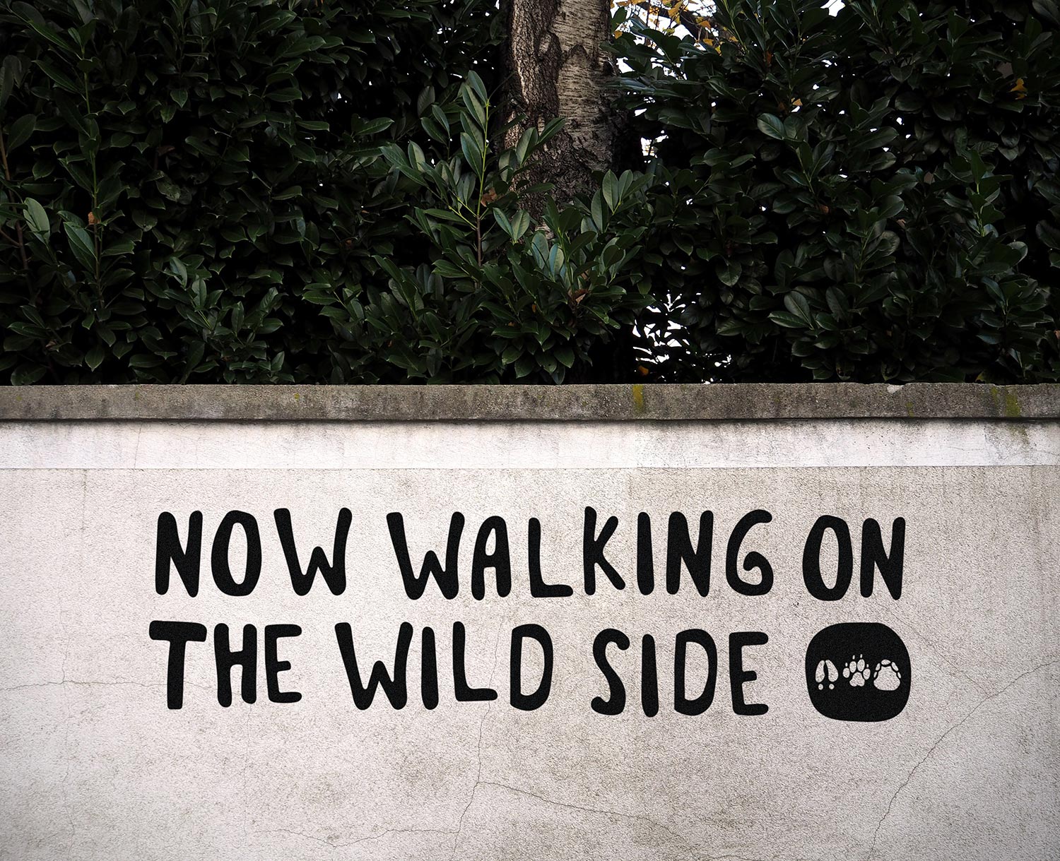
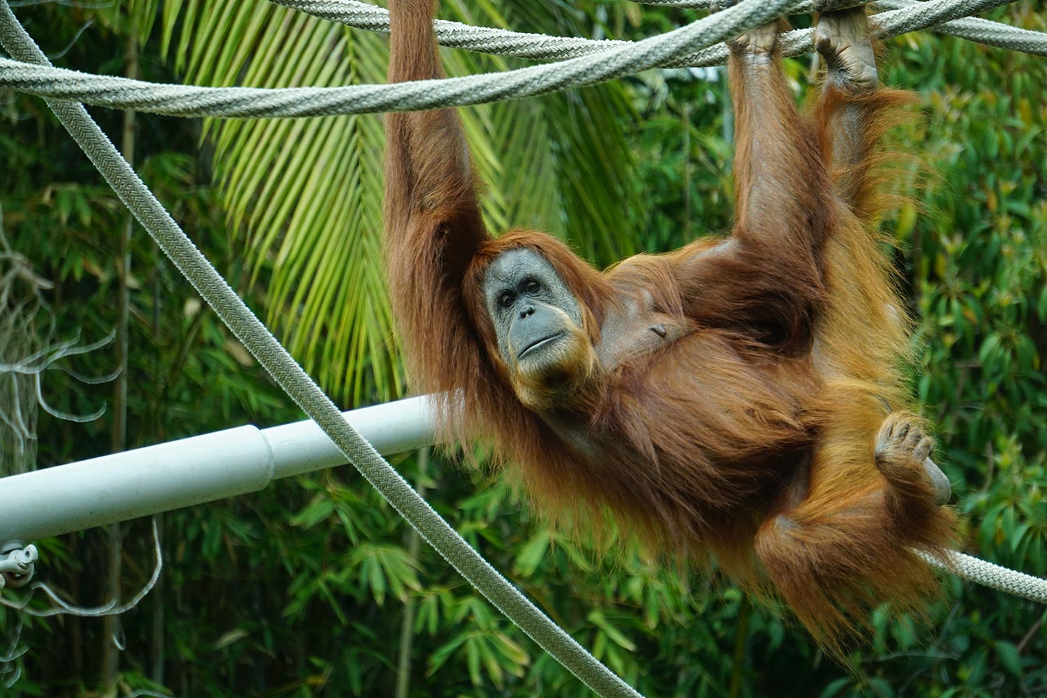
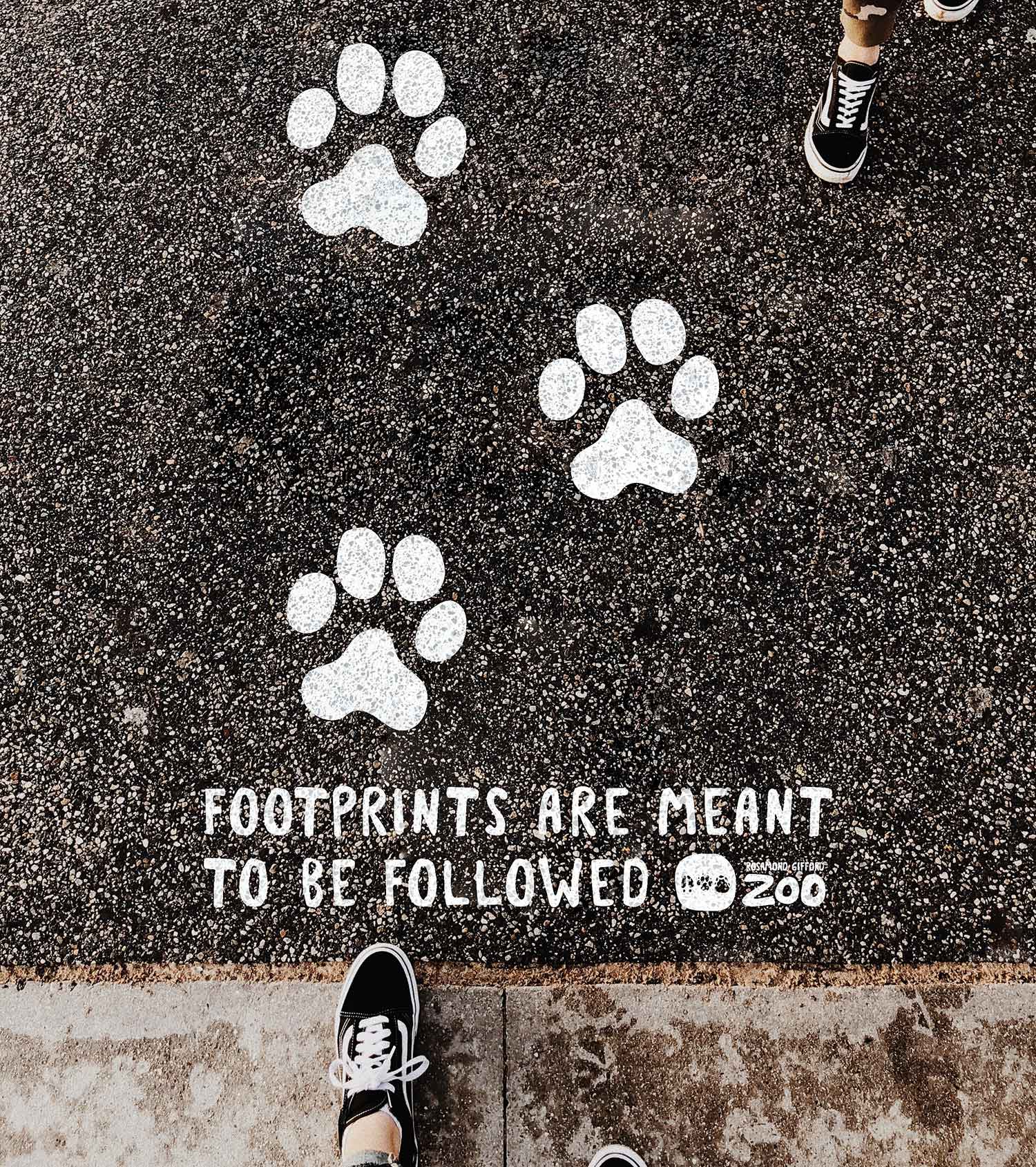
Instead of using animals in the logo, I thought footprints would be unique and functional to the branding. Footprints tie into the education and conservation efforts of the zoo as they are used for tracking and classification.
Redesigned logo
It was difficult finding a font I liked that conveyed the "adventurous" spirit I wanted. I ended up tracing and combining a few different forms from existing fonts to create the main font of the brand.

Font in use
The color palette was based off of the different habitats that the animals of the zoo are found: forests (green), water (blue), deserts (orange), polar regions (purple), mountains (brown), and (even though not a real habitat, the zoo has a small group of domesticated animals so I felt it necessary to include) farms (red).

Zoo Map
The zoo already has a nicely illustrated map but it is very busy. I took their original idea and simplified it - instead of using images to indicate exhibit locations, I used the animal’s footprints. I reduced the number of trees and colors as well.


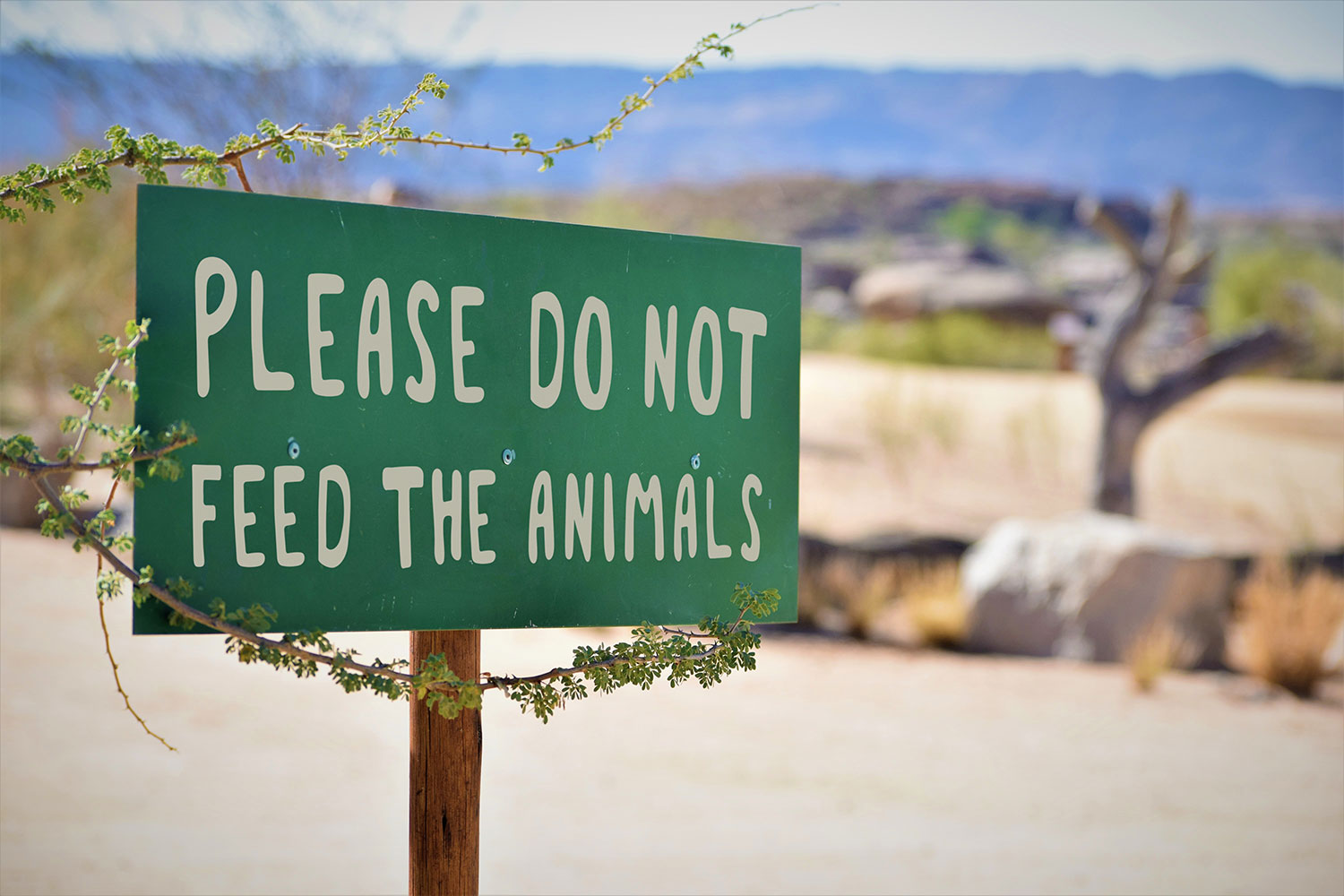
The outside of the map brochure featured the zoo's rules and information so that visitors (and animals) remained safe and happy.
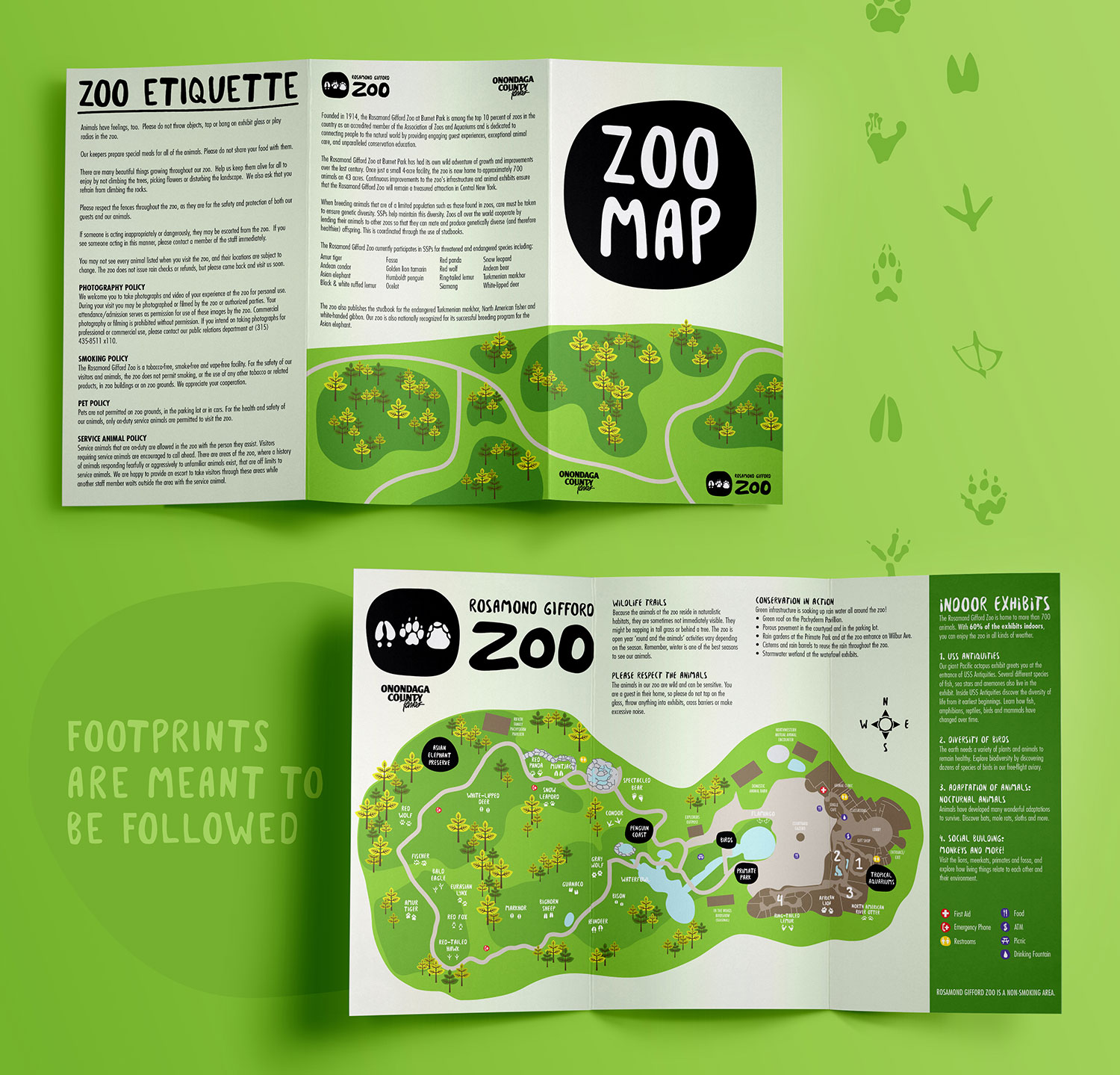
Zoo Map Brochure
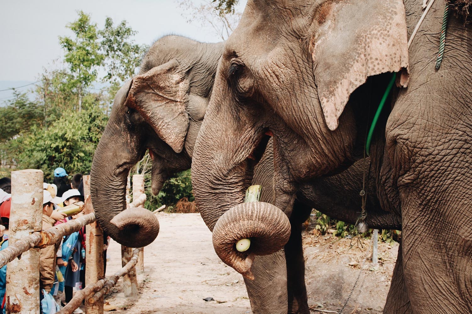
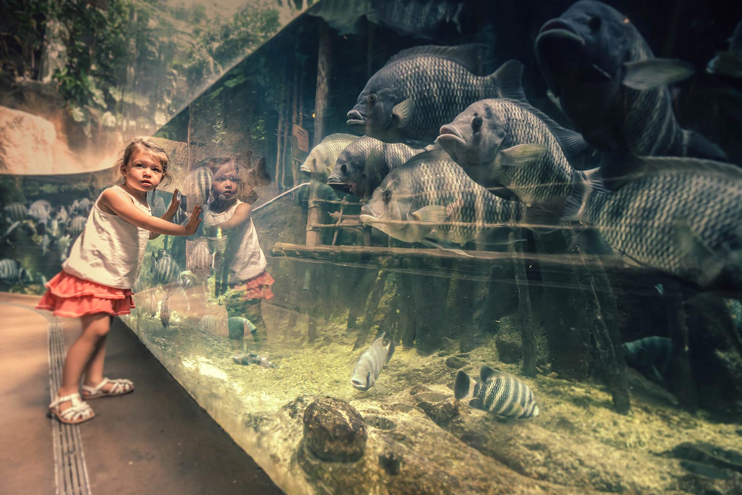
Now for the fun stuff.
Part of the reason I was so interested in the zoo's rebrand was because of all the things zoo’s need for their parks. Souvenirs, advertising, environmental and wayfinding pieces, all of it is used to create and enhance the experience of the visitor.
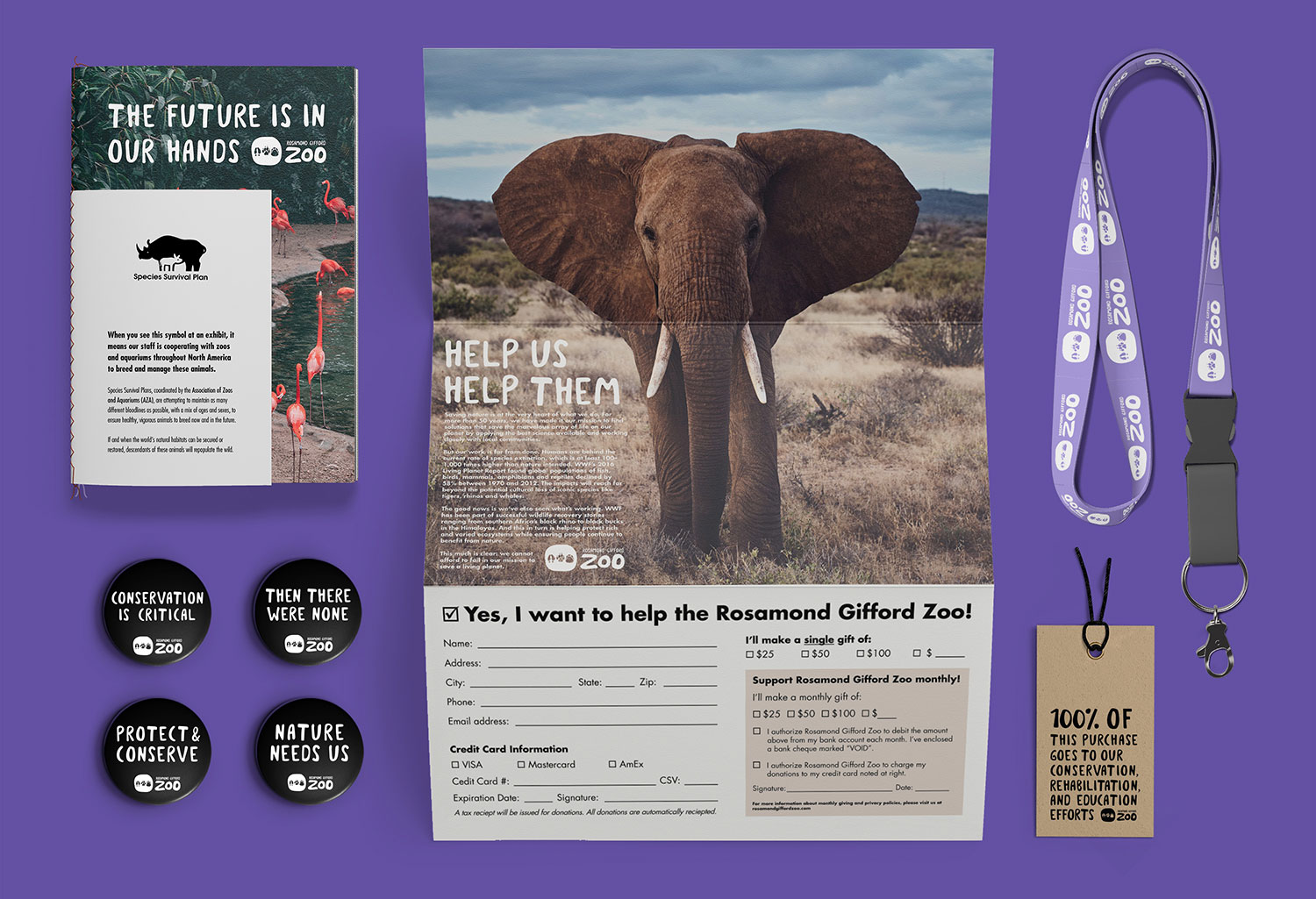
Donation Letter and Conservation Goodies
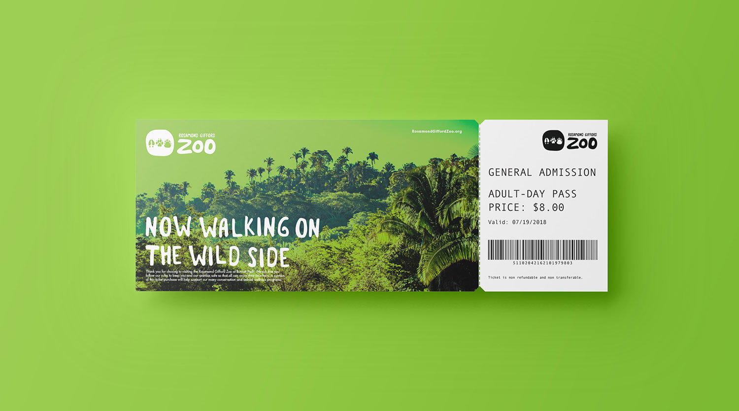
Vistor Ticket
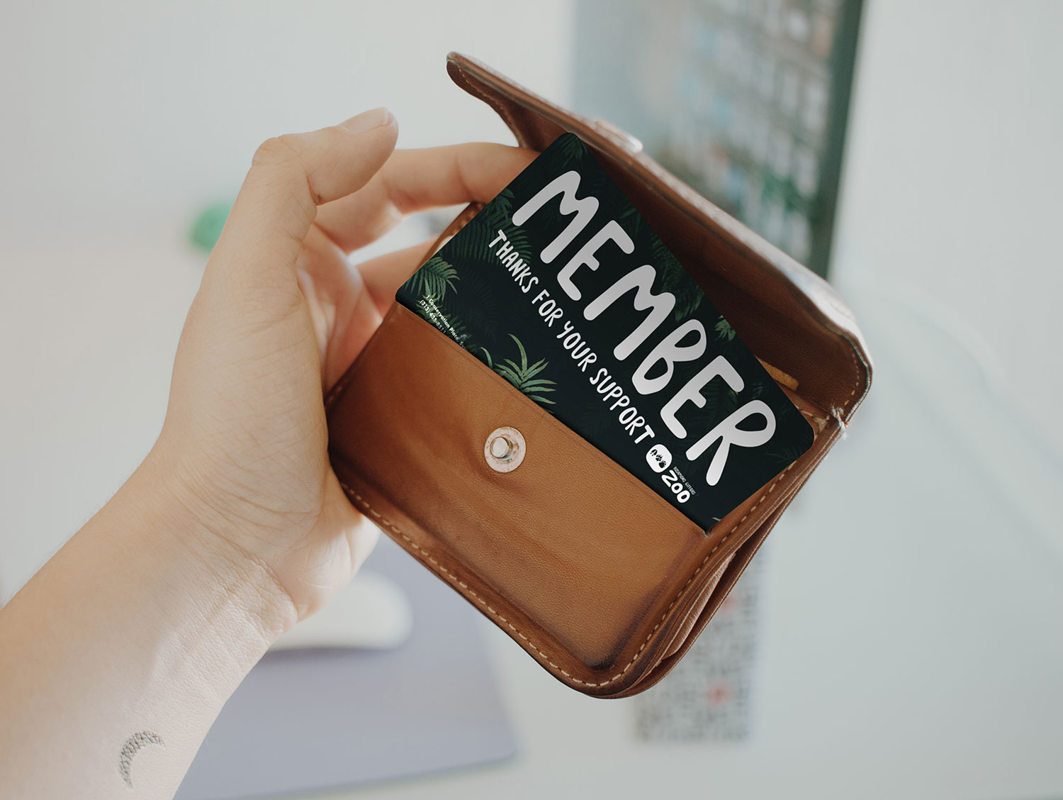
Annual Member Pass
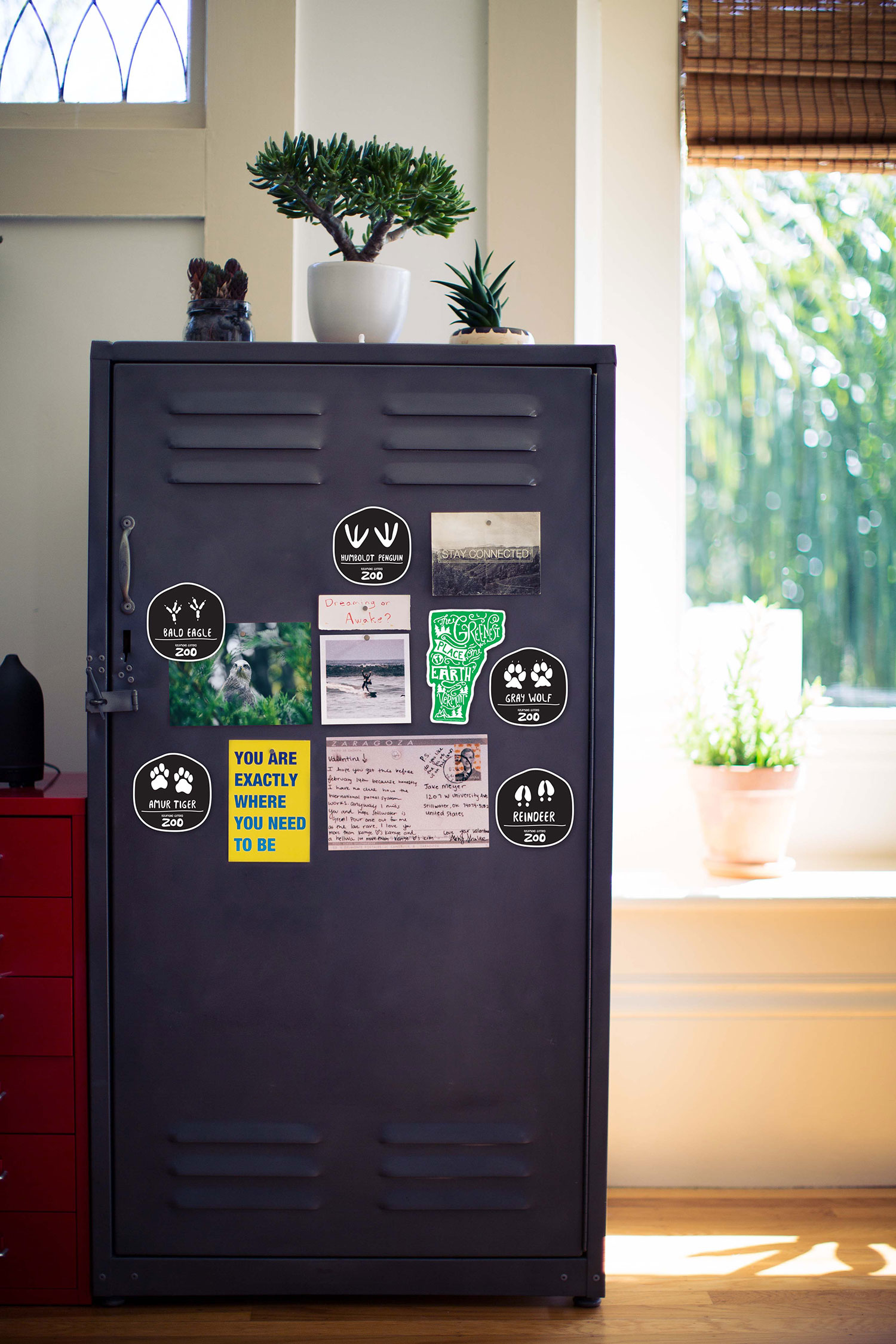
Footprint Magnets
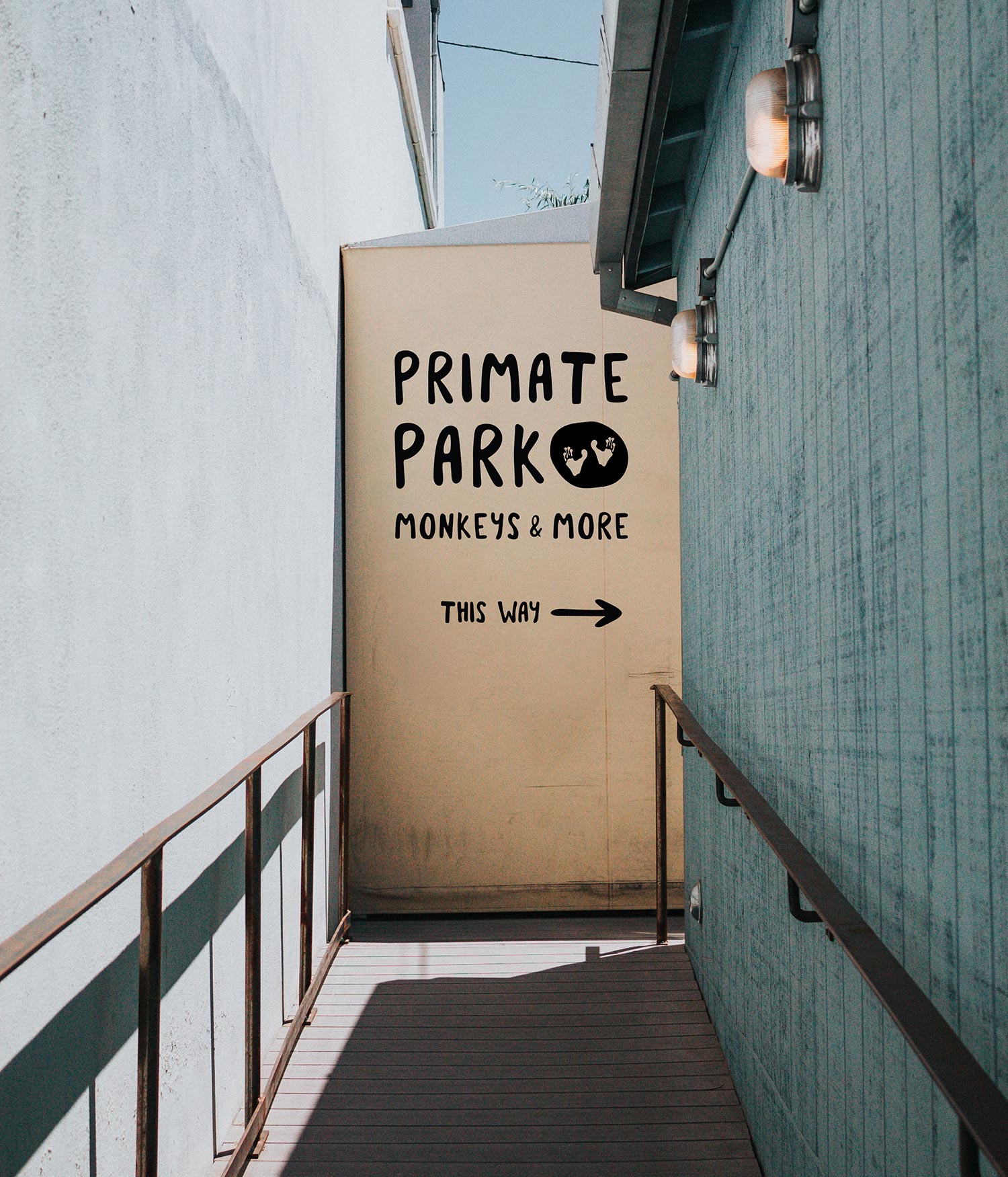
Wayfinding
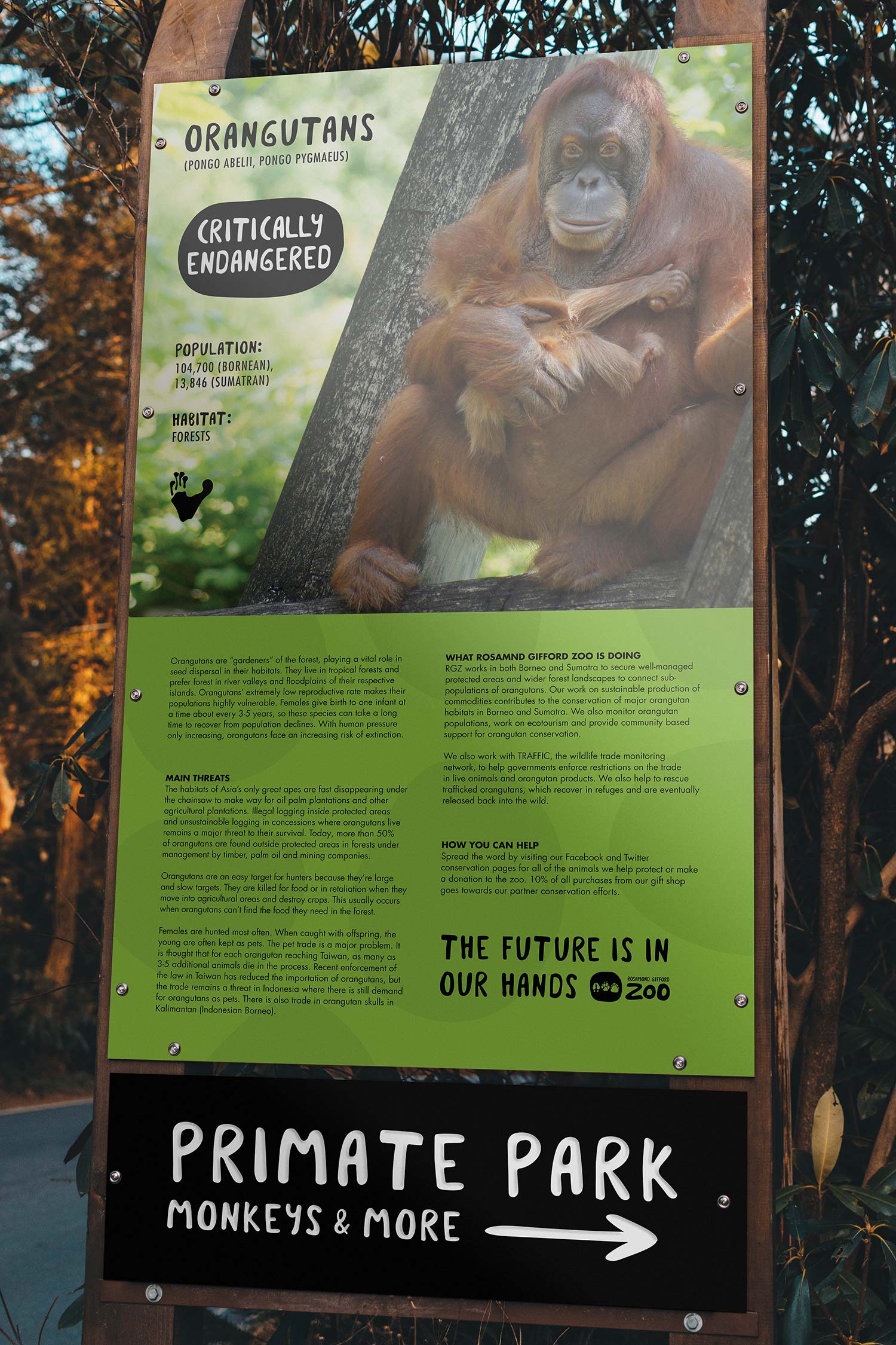
Conservation Poster
Crosswalk Advertisement
Maybe one day Rosamond Gifford Zoo will get it’s revamp. It's such a historic and iconic part of Syracuse and I would love to see it get the attention and development it deserves. (And if that marketing manager is still out there… I’m still interested.)